Where did we start?
While conducting user research on pain points within the NYU Community, many individuals reported having issues using the NYU Albert student information platform. Specifically, navigating its non-intuitive interface, using it to complete important academic tasks, and accessing NYU academic advising on it.
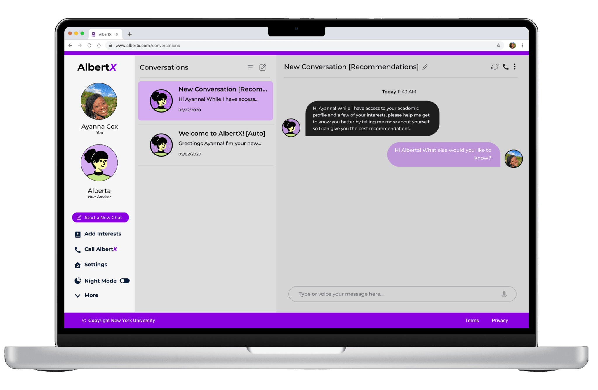
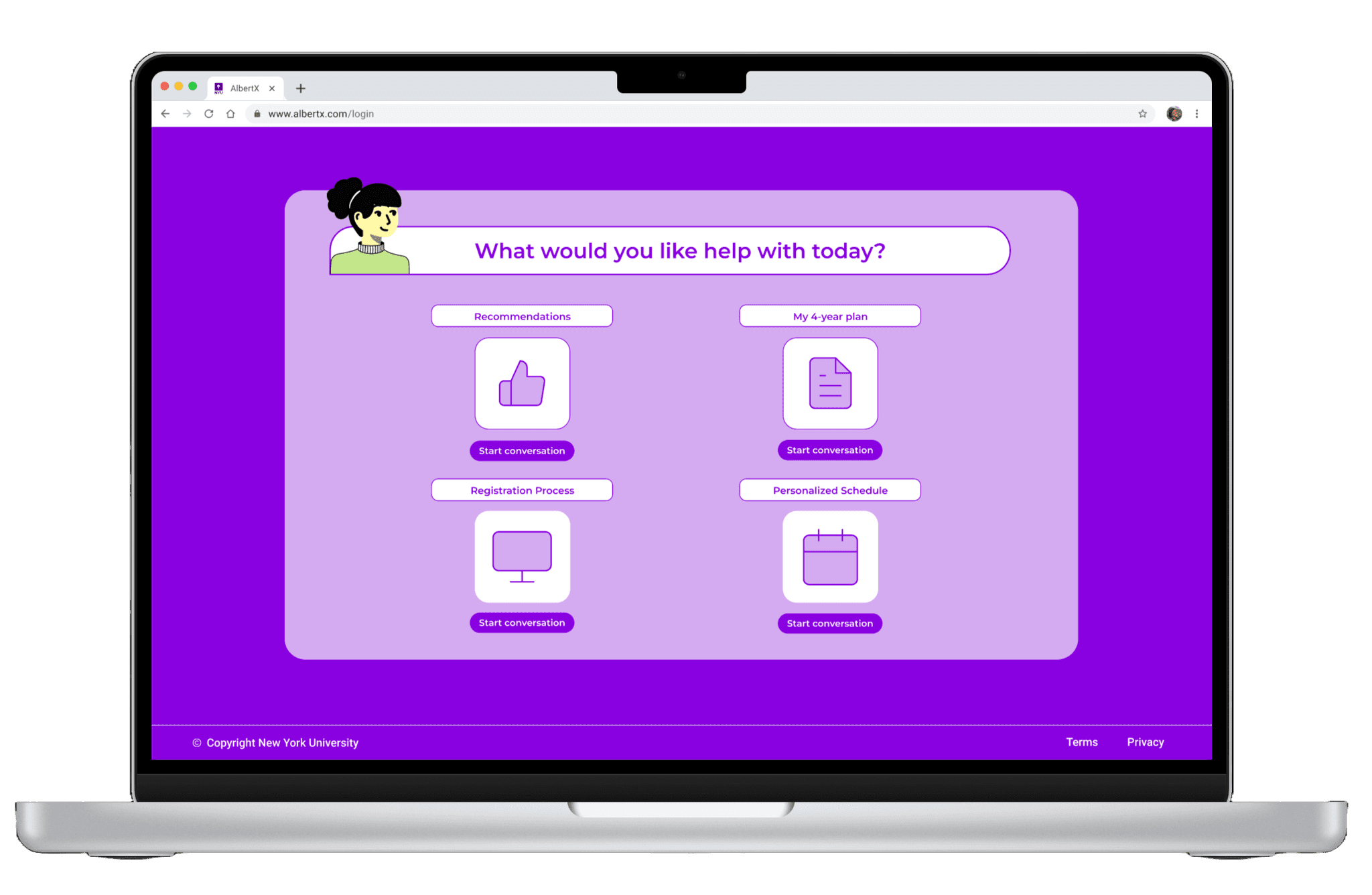
We aimed to create a new informational platform that would allow a more personalized advising experience for students. We developed AlbertX - a platform where users are able to have 24/7 digital conversations with a customizable advisor avatar that guides them based on their individual profiles.
Getting To The Root
While researching the NYU academic advising process, we discovered that students often feel unfulfilled with the quality of academic advising that they receive. They complained about experiencing brief meetings and complicated email chains that don’t fully address their concerns. Due to this, these students often face struggles in finding resources, registering for classes, and planning their coursework.
Using the "Five Whys" technique, we aimed to understand the root cause leading to unfulfilling academic advising:
Design Process Overview
User interviews & secondary research
Synthesis + Mapping
Ideation
Design and Prototype chosen solution
Usability Testing
Iteration
Interview Highlights
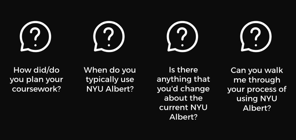
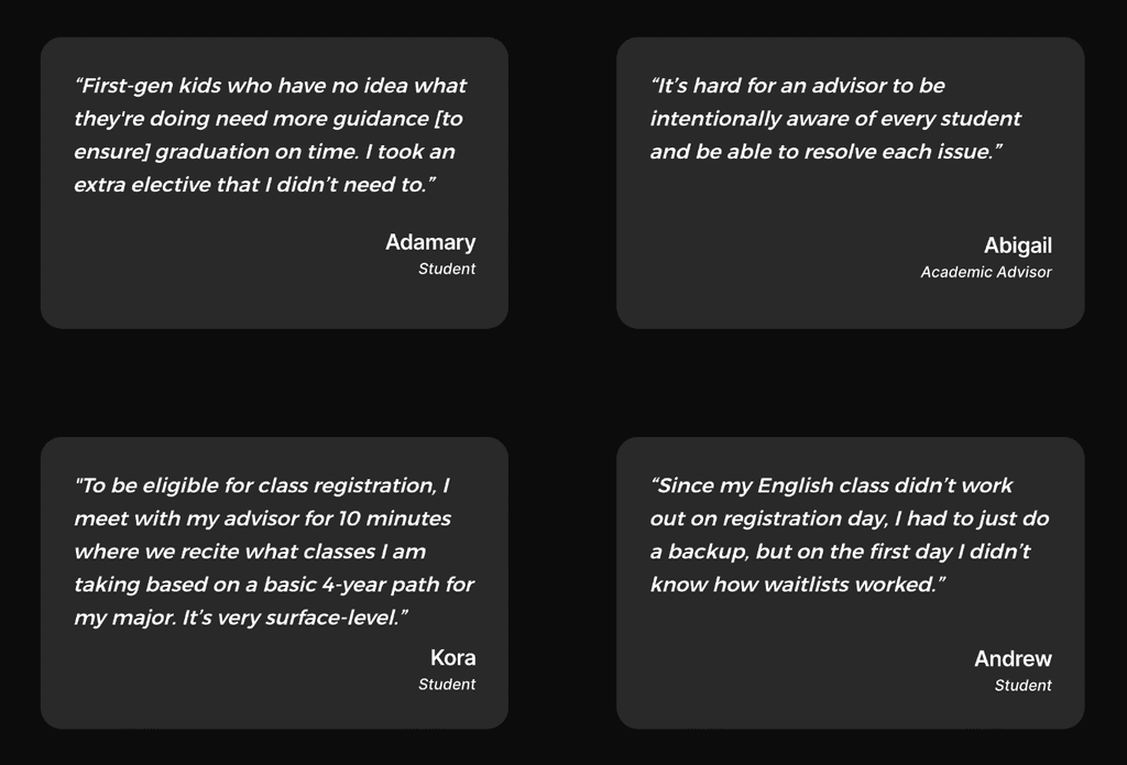
We conducted 9+ interviews with students and faculty about their personal experiences with the current NYU Albert system and academic advising experiences. Below are some of the questions that we asked and a few direct quotes from interviewees:
Key Insights
Guidance should feel personalized, as every student has different goals and experiences.
People want to find information in the same place, and access it on their own time.
Students tend to find out about academic limitations when it's relatively too late.
AlbertX: An A.I. Chatbot that Understands You
AlbertX is a platform for the NYU community that will give users 24/7 access to a virtual chatbot academic advisor — powered by fine-tuned generative A.I. — that uses both supervised and reinforcement learning techniques. The chatbot will have access to user information through the original NYU Albert cloud storage system.
Why this solution?
In this digital age, users tend to feel more connected to platforms that feel built for them individually.
Added personalization through avatars offers a creative, fun touch to a system that often seems more formal and daunting.
A chatbot can allow for more candid conversation, in case users are uncomfortable bringing up sensitive information with advisors (i.e. finances, grades, etc.).
24/7 access offers a streamlined, quicker process of getting information.
Stand-Out Features of AlbertX
Can rank and recommend classes based on popularity and student profile.
Can generate multiple mock schedules and 4-year plans upon request.
Can allow "phone calls" to improve accessibility and enhance convenience.
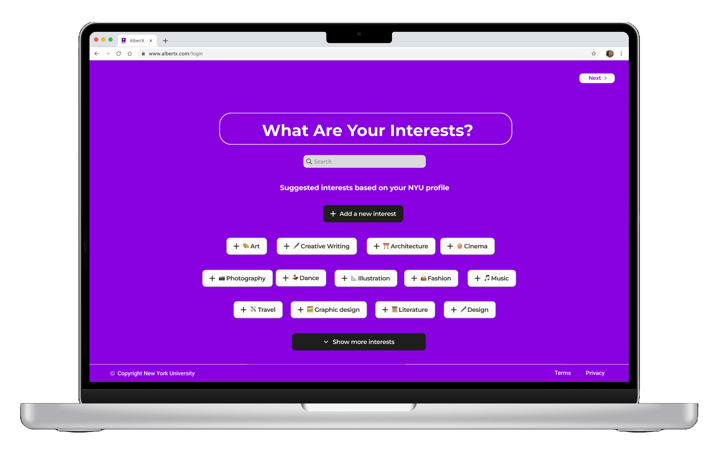
Can provide club/event recommendations related to student interests/major.
Can summarize conversations, title them, and archive them for later access.
Can curate a personalized schedule w/ assignment deadlines and due dates.
Improvements Made After Testing
After testing the first prototype with users, it was apparent that there should be some improvements made to the overall user flow. Here are a few of the iterations made and why:
Refinement of landing page interfaces:
Scaled main conversation landing page more appropriately and consistently to give more modernized, clean look.
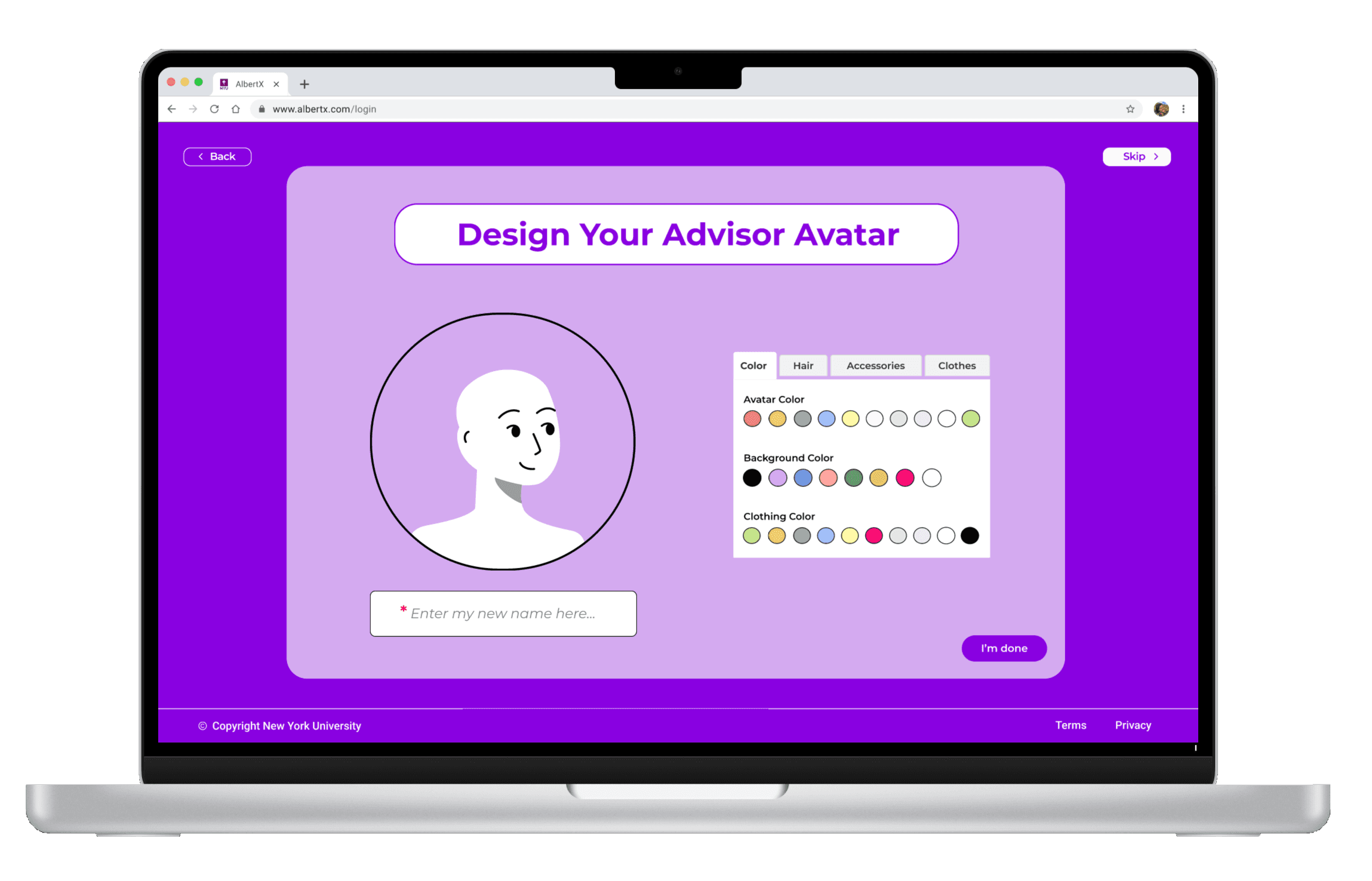
Added background to avatar creation page as well as tabulated categories make the process a more contained, straightforward activity.
Iconography improvements:
Added filter and search icon for users to filter conversations easily.
Added visual consistency in size and color to icons.
Implementation of an "Are You Sure" pop-up
Added for individuals who wanted to go back after beginning to design their avatar, warning them that they would lose their progress, as it is frustrating to learn after the fact.
Clearer categorization for the avatar creation:
Content design (copy) improvements to clarify color categories; there is now a clearer separation of color choices for the avatar, clothing items, and the background.
Button changes
Standardized button designs and implemented them where there were previously underlined words, improving navigation for users
Implemented an "I'm done" button on the avatar creation page, as "Back" and "Skip" were the only other options previously
Style Guide
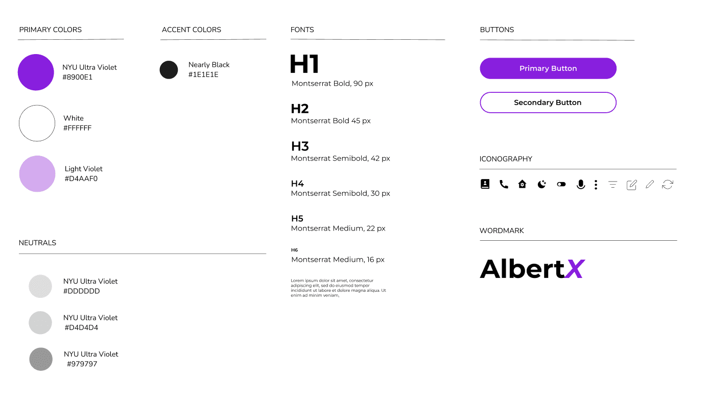
Below is the style guide that I used to standardize the design principles for the AlbertX platform. It helped with consistency and scaling visual components in color choice, fonts, and iconography.
interest INPUT PAGE
Next Steps
Usability Testing:
Determine current areas of improvement for the prototype, we plan to host a group of diverse individuals to interact with it. This will allow us to gain insight on which aspects work and those that do not. We want to make a product that appeals to people across the NYU Community, so it will be helpful to discover edge cases and iterate based on findings.
Pitch to NYU IT:
In order for our product to make the intended impact on the community, we would need approval to develop and launch it. Our goal is to be able to make our proposal appealing and to seamlessly communicate a worthwhile value proposition to the NYU IT department.
